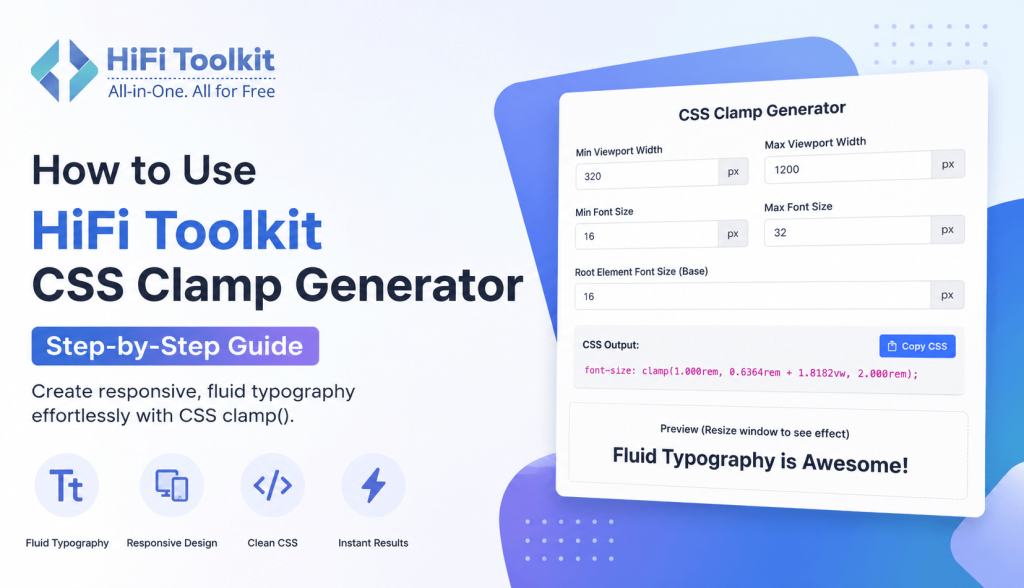
Previously, implementing responsive typography entailed having several CSS media queries. This is because of the complexity involved. With the CSS clamp() function, designers can now implement responsive typography with a single line of CSS.
The HiFi Toolkit CSS Clamp Generator makes the process easy by computing the required value. Rather than having to do some complicated mathematics, you simply provide some inputs, and the generator produces CSS for production.
In this tutorial, we’ll show you how to use the HiFi Toolkit CSS Clamp Generator, the importance of each input and best practices for creating responsive font sizes.
Check – > CSS Clamp Generator
What Is the CSS Clamp Function?
The CSS clamp() function allows you to define a minimum value, a preferred (fluid) value, and a maximum value.
font-size: clamp(minimum, preferred, maximum);For example:
font-size: clamp(1rem, 2vw, 2rem);In other words:
- The font size will never be less than 1rem.
- It will scale perfectly based on viewport size.
- It will never be more than 2rem.
This technique allows you to have fluid typography without having to write any media queries.
Demo
While it is easy to use the clamp() function, the process of determining the best value through calculation is difficult.
HiFi Toolkit CSS Clamp Generator does the math calculations and generates correct CSS codes within a few seconds.
Why Use the HiFi Toolkit CSS Clamp Generator?
- Improves responsive design
- No manual calculations
- Beginner-friendly interface
- Instant CSS output
- Copy-ready code
- Live typography preview
- Saves development time
Regardless of your level of experience in frontend development, the tool makes it easy for you to create flexible typography.
Understanding the Generator Inputs
Before using the generator, let’s understand each field.
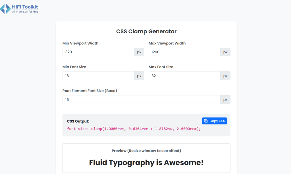
1. Min Viewport Width
This is the smallest screen width where scaling begins.
Example:
320pxThis is suitable for most smartphones.
2. Max Viewport Width
The largest viewport width where scaling stops.
Example:
1200pxOnce the screen becomes wider than 1200px, the font size will remain fixed.
3. Min Font Size
The smallest font size you want.
Example:
16pxYour font will never shrink below this size.
4. Max Font Size
The largest font size allowed.
Example:
32pxEven on very large displays, the font will not exceed this value.
5. Root Element Font Size
Usually:
16pxThe generator converts pixel values into rem units for better accessibility and scalability.
Step-by-Step Guide to Using the Generator
Follow these simple steps.
Step 1: Go to the CSS Clamp Generator
Go to the HiFi Toolkit CSS Clamp Generator website.
You will see input boxes for the viewport width, font sizes, and root font size.
Step 2: Insert the Minimum Viewport Width
Assume that your design begins scaling from mobile phones.
Enter:
320Step 3: Insert the Maximum Viewport Width
For desktop, input:
1200Step 4: Insert the Minimum Font Size
In case your paragraph font size must begin from:
16pxEnter:
16Step 5: Insert the Maximum Font Size
Assume that your font size must scale to:
32pxEnter:
32Step 6: Leave Root Font Size as Is
Keep it:
16pxUnless your project uses a different base font size.
Step 7: Copy the Outputted CSS
Here is what your tool will generate CSS like:
font-size: clamp(1rem, 0.6364rem + 1.8182vw, 2rem);Simply click the Copy CSS button.
Step 8: Insert it into Your Stylesheet
Example:
.hero-title {
    font-size: clamp(1rem, 0.6364rem + 1.8182vw, 2rem);
}
That’s it.
Your typography now scales smoothly across all screen sizes.
Live Preview
The live preview in the HiFi Toolkit CSS Clamp Generator is one of the most useful aspects.
Changing values will automatically update the preview text.
Try resizing the browser window to see the scaling effect of the font size between its minimum and maximum sizes.
Example
Suppose you want:
| Property | Value |
|---|---|
| Min Viewport | 320px |
| Max Viewport | 1200px |
| Min Font Size | 18px |
| Max Font Size | 40px |
| Root Font Size | 16px |
The generator instantly creates optimized CSS without requiring any calculations.
Best Practices
For optimal outcomes, consider the following guidelines:
- Apply rem units wherever possible.
- Set realistic minimum and maximum font sizes.
- Do not apply excessive scaling ratios.
- Ensure that typography tests well on mobiles, tablets, and desktops.
- Utilize fluid typography where there is added value to readability.
- Ensure spacing consistency along with font scaling.
Common Mistakes to Avoid
Using Very Small Minimum Sizes
Avoid values below 14px for body text.
Choosing Huge Maximum Sizes
A maximum font size of 60px may look excessive on large screens.
Ignoring Accessibility
Always ensure your text remains readable for all users.
Not Testing Different Devices
Preview your design on multiple screen sizes before publishing.
Browser Support
The CSS clamp() function is supported in all modern browsers, including:
- Google Chrome
- Mozilla Firefox
- Microsoft Edge
- Safari
- Opera
Older browsers that do not support clamp() are now rarely used, making it a reliable choice for modern web development.
Why Developers Prefer CSS Clamp
Advantages of using clamp():
- Cleaner CSS code
- Less use of media queries
- Responsive typography
- Easy to maintain
- Better UX
- Quick development
- Uniform scaling on all devices
Rather than managing several breakpoint CSS codes, you can accomplish the same by using one CSS rule.
Conclusion
The HiFi Toolkit CSS Clamp Generator will make generating fluid typography a breeze – quick, accurate, and painless. No more manual calculations for your viewport values; simply generate your CSS in seconds using an intuitive interface with live preview functionality.
No matter what kind of webpage you are creating (landing page, portfolio, business site, or web app), your responsive typography will enhance readability and create a great experience on all devices. Follow these simple instructions to generate your production-ready clamp() values.
Frequently Asked Questions
Yes. You can generate responsive CSS instantly without making any manual calculations.
No. The calculator will make all the necessary calculations.
Yes, you definitely can. This calculator works perfectly fine for headings, paragraphs, buttons, cards, and other texts.
Yes. Generated code is ready for copy and paste.
Yes. If the root font size of your project is not equal to 16 pixels, change the value in the corresponding field.